Date: 2010.
Product: eBay Garden lab - Search Results Page R&D. Exploring the future of searching eBay.
Product: eBay Garden lab - Search Results Page R&D. Exploring the future of searching eBay.
In 2010 eBay launched the eBay Garden page, an area where experimental experiences and features still under development can be open to the public for testing and feedback, in the same fashion of "Lab" initiatives found elsewhere.
Below are two Garden projects I worked on: Streamlined Search and Integrated Finding Experience.
Below are two Garden projects I worked on: Streamlined Search and Integrated Finding Experience.
1. Streamlined Search - eBay Garden
I participated as User Experience Designer and Interface Designer in the Streamlined Search project. It was an R&D Agile Scrum project intended to rethink eBay searches. It displays real eBay inventory in a manner that provides speed, personalization, and facilitation of choice, by means of innovation, simplicity, efficiency, and removing the clutter.
I participated as User Experience Designer and Interface Designer in the Streamlined Search project. It was an R&D Agile Scrum project intended to rethink eBay searches. It displays real eBay inventory in a manner that provides speed, personalization, and facilitation of choice, by means of innovation, simplicity, efficiency, and removing the clutter.
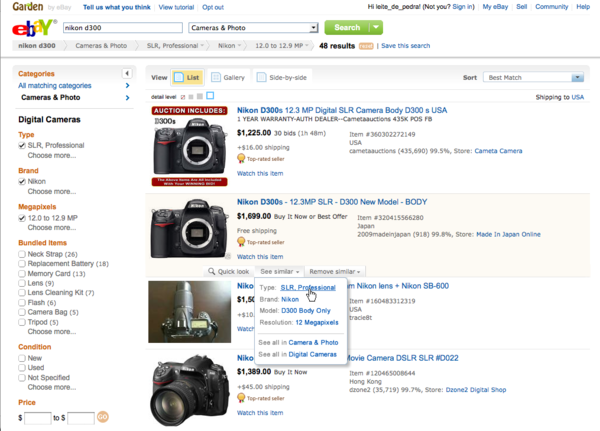
New search results page, with a simplified header, reduced amount of line dividers and list information organized around the image (triangle view). Other visible features are: detail zoom, fly-outs for categories, summary line under the search box, contextual navigation on item hover and allowing refinement by similarity or specific aspects.
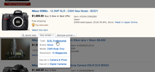
"Contextual Navigation" detail. On mouse roll-over, users can pivot or exclude results based on the item properties.
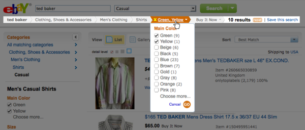
"Summary Line" detail. Category narrowing and applied refinements are displayed as a bar above the search results. Users can cancel individual refinements in the summary line and are able to modify / multi-select them in-‐line, with no need to go to the left navigation.
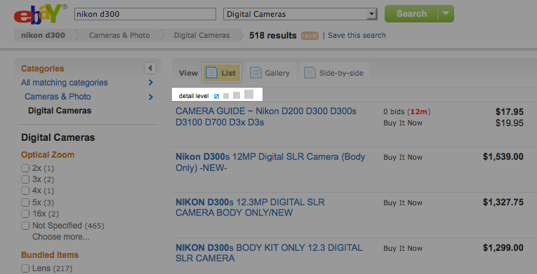
Detail level as a way to bring advanced customization options as a simple consumer feature. Each 'zoom' level is coupled with customization options, displaying more or less information.
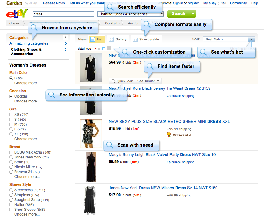
Tutorial page highlighting new features.
2. Integrated Finding Experience (IFX)
This project is another exploration on the eBay search results page, leveraging some of the lessons from Streamlined Search R&D project.
This proposal addresses user needs identified on usability labs and home visits:
- wasteful back and forth between search results and item detail page.
- need to compare items in a easy way.
- need to save 'buying candidates' through several sessions until deciding for one to buy.
- save/share interesting findings for oneself and also for family and friends.
The solution was to create a finding environment where the main tools for decision making are at hand and integrated in the buying flow: a preview pane that does not cover information about the item, a collection tray for organizing and saving buying candidates and a simple compare feature to find a winner.
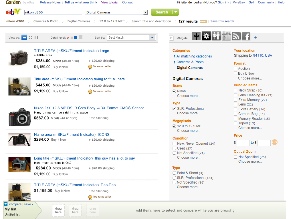
In this study, the IFX features are integrated with the Streamlined Search project.
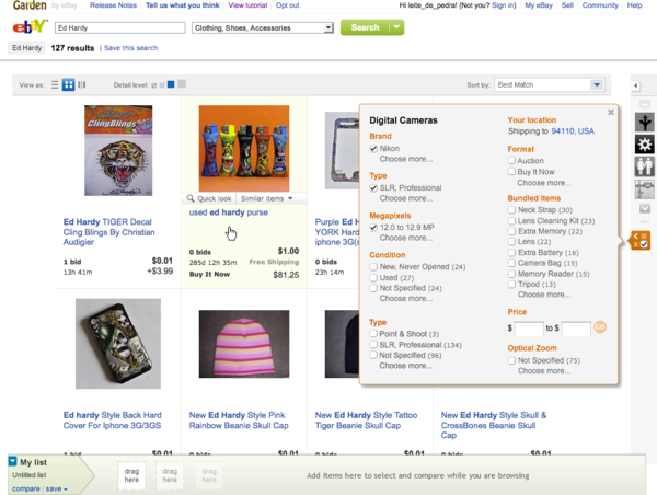
Note that the refinements are on the right. Above the refinements there is a widget bar. Widgets would expand over the right column, pushing refinements down.
Note that the refinements are on the right. Above the refinements there is a widget bar. Widgets would expand over the right column, pushing refinements down.
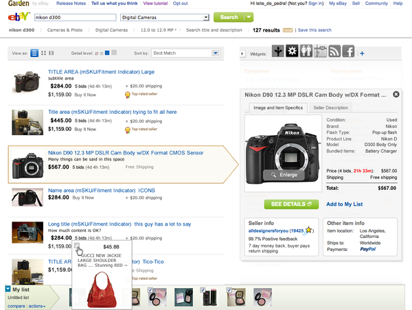
Search results page with an item selected and the correspondent information on the preview pane on the right.
The collection tray is placed on the top of the page, under the header. The header and the tray are fixed when scrolling.
The collection tray is placed on the top of the page, under the header. The header and the tray are fixed when scrolling.
In Gallery view (with large images in a grid), the right column would become a vertical strip. Refinements would be available on demand, allowing more space for results content.
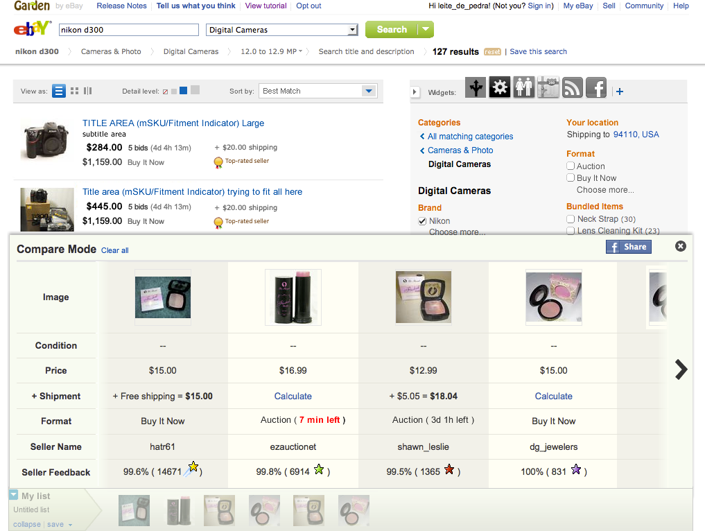
Items collected on the tray are compared side by side on the Compare mode.