DATE: 2018-2021
PRODUCT: AR Storytelling experience running on Meta Portal hardware.
ROLE: I led a team of designers, producers, creative engineers, and content agencies. I was responsible for defining the UX and the guidelines that would keep the integrity of the experience while scaling through partnerships.
IMPACT: We developed Story Time V1 in a record five months, in time for the public launch of Portal in 2018. Story Time became a defining feature of the device, loved by users and a star for marketing messaging—together with Smart Camera. The experience was a driver for the key metric "talk time." Launching new stories had the power to reactivate users to the platform.
Applying AR technology to help families connect when remote through enhanced storytelling
Have you ever tried to speak with a kid over a call? How could we help remote parents or grandparents connect with young kids beyond the 10s of attention span?
Story Time's ultimate goal is engagement and connection—not passively consuming content as screen time. We left room for each storyteller's quirks, tangents, mistakes, and improvisations. This created a viewer experience that is unique for each person. We used available technology like AR masks, illustrations, and sound to bring stories to life and create an element of play in which the narrator is the center of attention.
Opening screen during a call, narrator view.
Selecting stories. Some titles were offered in multiple languages.
Navigation with live preview of effects.
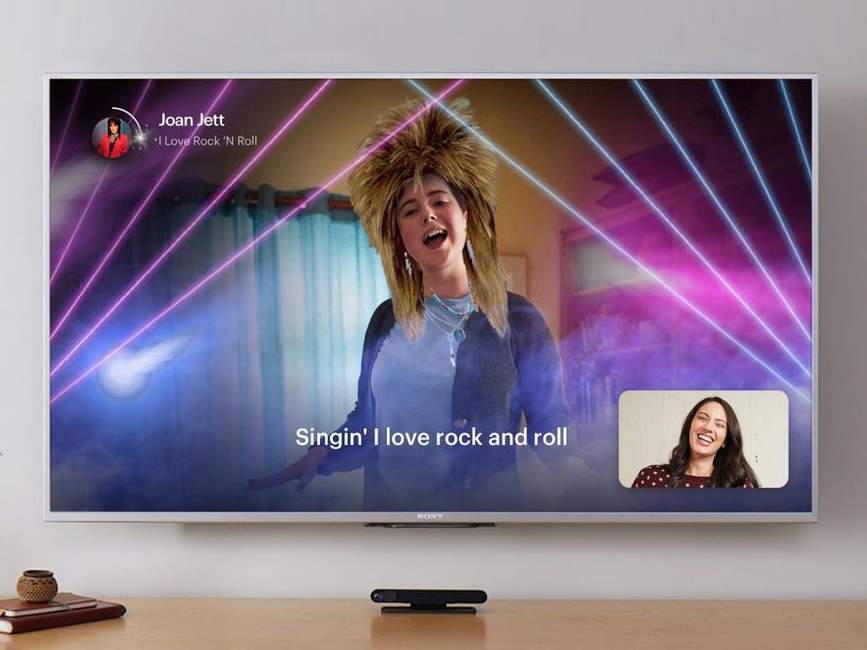
Examples of masks applied during the story.
Keepsake photo at the end of the experience.
Process & evolution
Story Time V1: Focusing on emotional connection
For the first release of Story Time, we had to be ready for the 2018 holidays (the initial Portal launch) and deliver a delightful experience to help adults connect with kids over video calls.
We refined the interaction model during a 5-month cycle through several iterations and user research rounds. I defined Design Principles and guidelines for the XFN team to ensure that we stayed within the original purpose of technology facilitating engagement through human expression. We had to be vigilant to avoid falling into the trap of gimmicky tech use or creating a passive screen time experience.
Story Time V2: Creating a platform for scaling
Story Time became very successful, and users demanded new titles every couple of months. But new titles were expensive due to the high level of craft and customization. Partnerships with movie studios and franchises helped to share the costs. However, it was still a laborious and time-consuming process.
We had to find ways to scale and reduce the time and cost of producing new stories. Engineering initiated an effort to simplify the workflow of the authoring tool. On the PM/Design side, we defined as priorities:
• Improve the replayability of each title through dynamic stories.
• Diversify content to reach new audiences
• Leverage new technologies to improve interactivity and expression.
• Empower AR creators with a creative toolkit.
Design sprint with designers, engineers, PMs, art directors, and writers to define the second iteration of Story Time.
Updated Design Principles, with scale and inclusivity in mind.
Opportunity areas for exploration and product improvement.
From the beginning, we thought about making the story dynamic to improve the replayability per story. We postponed this functionality until late 2019, when we launched several titles where the user could choose between preset options, each leading to a different story outcome.
Some ideas were never made to production due to technical complexity or issues in partnership negotiation. For example, below is an internal prototype to explore how we could use a mechanic similar to Mad Libs to make the story different every time.
Prototype showcasing multiple choice and merging the two sides of the call into one single composition.
"Mad Libs style" prototype.
Loved by people and by marketing
Story Time became a strong hero experience to market Portal devices. It was among users' two main recall features when describing what they like on Portal or why they would recommend it to friends.
A fun campaign with the Muppets for the 2019 holidays.
Mark Zuckerberg presented Story Time at F8 in 2019.
"Facebook's Story Time is legitimately awesome. Another feature clearly designed for families to feel more connected is Story Time. Leveraging Messenger’s Snapchat-like masks and filters, Story Time allows the person reading Portal’s built-in stories to become the story." — USA Today review
"My parents (and their grandkids, my children) had used Story Time every morning as a daily use case -- it was the killer app for Portal and the reason they used the device altogether (so good!)." — Portal user
